How do we streamline the onboarding for this burgeoning enterprise?
UX DESIGN CASE STUDY
PROJECT DETAILS
Team size | 4 members
Project type | Partial Redesign
My Role | Lead Designer
THE TEAM
Jeffrey Bean | Lead Designer
Joana Kowalska | Lead Designer
Laura Olivas | Project Manager
Alyson Mar | Lead Researcher
THE PRODUCT
Partner Fleet’s turnkey marketplace platform makes it easy to go to market with partners and drive partner adoption.
You have three main goals: recruit & launch new partners, manage the relationship, and ensure the continued performance of each partnership. Partner Fleet increases the appeal of your program, decreases time to value for new partnerships, and improves performance of each partnership. When all this goes right, relationship management is a piece of cake.

THE PROJECT
In this project, we targeted two onboarding workflows to streamline – the marketplace setup and the partner page setup.
Our clients pinpointed these two flows because the current self-service onboarding process is resulting in more client calls.
Partner Fleet clients that went through the personalized onboarding were highly satisfied, but there was a large time investment on both sides. With our design, we wanted to empower users to be equipped and confident to self-serve, saving time and resources.

THE PROBLEM
Onboarding is a huge lift – requiring time, resources and buy-in from all decision-makers. Partner Fleet wants to make onboarding onto their platform quick and simple because too many phone calls takes time away from managing relations.
THE GOAL
Partner Fleet is looking to strike a balance between automation and personalized service when onboarding partners onto their marketplace platform.
01 DISCOVER
- USER INTERVIEWS
- COMPETITIVE & COMPARATIVE ANALYSIS
HOW WE DID RESEARCH
We performed competitor research based on examples the client provided, then comparative research and multiple interviews with Project Development Managers to specifically target and learn about onboarding at multiple companies and what made the experience successful, engaging, and informative as well as preferred methods of engagement by users when learning a new application and how they want to be introduced to new actions.

INTERVIEW QUESTIONS

Definition of Success
- What made your onboarding process successful? Why?
- How did you know you were successfully on-boarded onto the platform? (Success messages, pop ups, general visibility)
Crucial Info
- What information is most crucial to include in your company’s microsite? Why?
Timeframe to Completion?
- Was the timeframe of onboarding what you expected? If not, why?
- What was the biggest impact on your timeframe for onboarding completion?
Describe Process
- On a scale from 1-5 (5 being most difficult), how difficult was the onboarding process?
- Please describe your experience with the onboarding process. What worked/didn’t work?
User frustrations/unclear guidance
- Was there a feature or section of the onboarding process that was frustrating or unclear? Why?
Easy portions of onboarding
- Was there a feature or section of the onboarding process that was enjoyable? Why?
User learning preferences
- When learning a new feature, how do you prefer to be introduced to it?
Competitive & Comparative Analysis
Interview Insights
We performed user interviews targeting CSMs, Marketing Professionals, and Power Users of marketplace platforms to learn about their onboarding experiences. Based off of our user interviews we noticed a few prominent pain points.


02 DEFINE
- Affinity map
- Persona
- Problem statement
- HMW statements
- User journey map

USER INSIGHTS
We asked users of actual onboarding software what worked and didn’t for them and learned about their preferences. Here are a few quotes from our interviews.
User Persona
From the information gathered we created a persona, PDM, who represented the frustrations, needs and behaviors of our ideal user.
After creating our Persona we condensed our insights into this Problem Statement and these How Might We Statements.
How is the current experience?
Here, Our user journey map expresses how our Persona feels going through the current site and helps us focus on the best places to design solutions. It was not a great experience navigating the current site.
The largest areas of opportunity
- Show the user how their data will be displayed
- Add guidance through the onboarding process
03 IDEATE
- Proposed Site map
- Proposed User flow
- Heuristic Evaluation
A Cleaner Flow
In our proposed Site Map we grouped more similar items together, removing extra navigation for the user.
A Detailed Look
we wanted to perform a more in-depth evaluation of the onboarding process with Partner Fleet and performed a Heuristic Evaluation of their dashboard and administrative facing pages to prioritize and inform our design decisions. The orange numbers below show our top 3 areas of focus.
How about something natural and intuitive?
From our proposed site map we created a user flow that felt intuitive and natural. Users would be guided to create and customize their marketplace easily and then have the option to jump right into building their partner page, as denoted by the dark blue circle.
04 DESIGN
- Mood board
- Style Guide
- Sketches
Getting set up for success
We felt a mood board was important for us to stay aligned with the pre-existing look and feel of Partner Fleet. The initial colors were great, so we took those and expanded the current pallet. The increased saturation had a friendlier feel and looked more inviting. We chose a spectrum of colors that were warm, friendly, and energized.
What is a Crazy 8, you ask??
Doing 8 sketches within 8 minutes is actually really fun, challenging and really works your brain muscles. Doing these as a group helped us get in the right space to design effective and clear solutions.
We went through several sketching sessions before building out the first prototype. My focus was a simplified flow and making sure are new proposed features worked well with the current site.
USER INSIGHTS
Building off of the mood board, we created this style guide to maintain consistency and uniformity throughout the design process. There was a major focus on giving visual guides for users such as a progress bars and clear indicators like pop-ups.
05 ANALYZE
- Low-fi Wireframes
- Usability test
- Proposed changes
- HiFi Prototype
- Next steps
Steadily moving towards a solution
Our initial lo-fi frames were influenced by the current layout of Partner Fleet’s dashboard. We had a few initial sweeps of trying to condense pages and add visuals to reduce text overload.
Hi fidelity prototype
With our feedback from usability testing we listened to our users need for more visual guidance and with that in mind we performed an overhaul of our marketplace and partner page walkthroughs. You can see the changes in the prototype below.
Cleaning up the dash
Our pre-test dashboard page had a CTA to start onboarding, however, there was a lot of information in the set-up. The focus of onboarding was taken away, by the rest of the dashboard.
On our post-test dashboard page, we added a spotlight to emphasize getting started and made the CTA larger and more inviting.
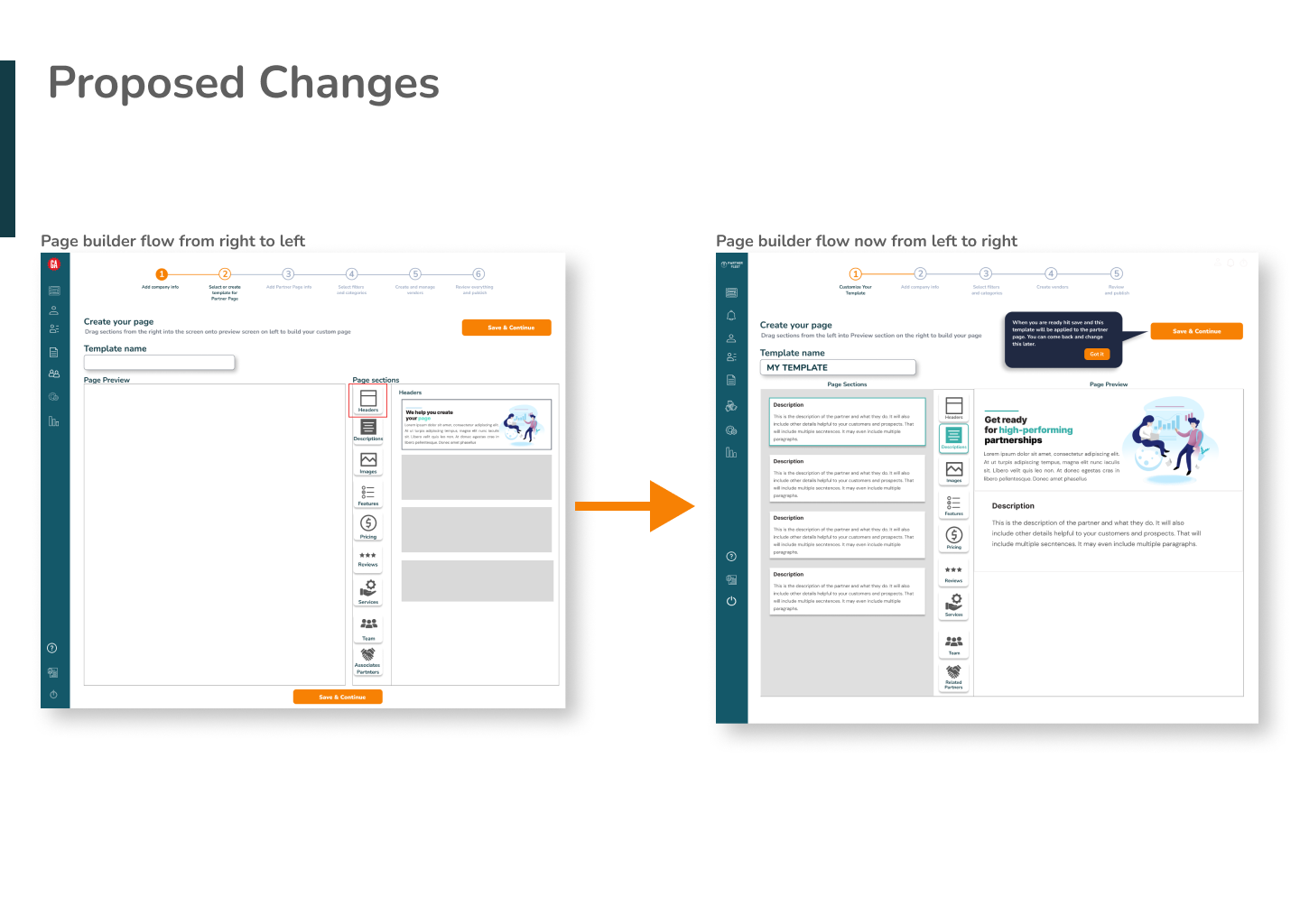
Changing for the good
In the pre-test page builder flow, the preview pane was on the left and the tool bar was on the right. Based on our research, this was a common layout that we applied to our initial design. However, after usability testing, two users had difficulty navigating the page builder flow as they felt it was counter-intuitive and there was a lack of visual guidance.
The numbers that spoke to us
75% of our users had no errors navigating the onboarding process. Most users found the flow very easy – the average rating of difficulty was 1.5 out of 5, 5 being the most difficult. Half of our users completed the process in 2 – 3 minutes.
What we learned from this – The page builder felt a little counterintuitive in its current layout, There was also some confusion around language used and where uploaded images would exist.
Testing always helps
Test results added to what we had learned along the way helped us define our next steps.
First step
We felt like being able to login on the partner fleet site itself should take priority so users don’t have to navigate away from the site to access their dashboard.
Next
- Will be iterating on the current UI to increase usability,
- performing accessibility testing as well as A/B testing on the page builder component.
For future updates
- video walkthroughs,
- revisions of current site copy- to be more user friendly,
- time estimates on each task,
- matching the walkthrough documentation to current site navigation and utilizing tography to create visual hierarchy, will continue to increase usability for Partner Fleet.


